Introduction
The Assistant module allows service providers to create interactive, structured, and easily navigable guidance systems for users. It serves as a digital guide, helping users access information, troubleshoot issues, and navigate to ticketing, video sessions, and other platform functionalities. By configuring a Text Assistant, service providers create decision trees that streamline customer support and enhance the user experience.

How to Get There
- Select Templates from the side menu.
- Select a template.
- Open the Modules Tab.
- Select Text from the side menu.
How the Assistant Works
Assistant Structure
The Text Assistant consists of multiple interactive elements, which are linked through action buttons. Users navigate the Assistant by clicking these buttons, which direct them to other elements, modules, or external links.
Important:
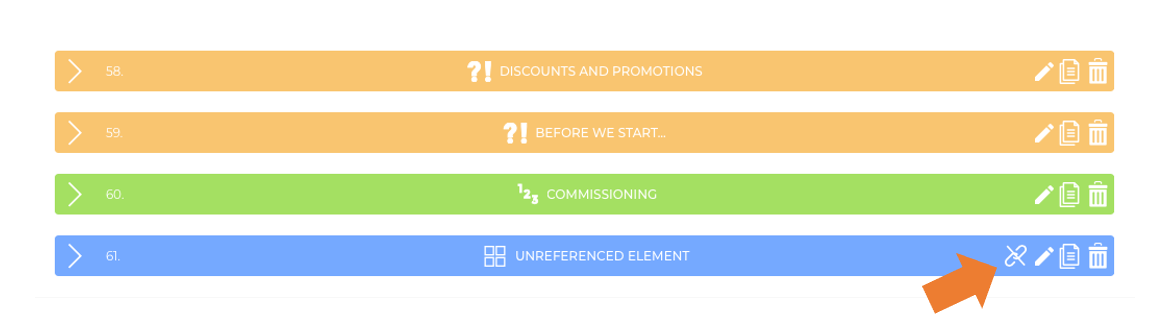
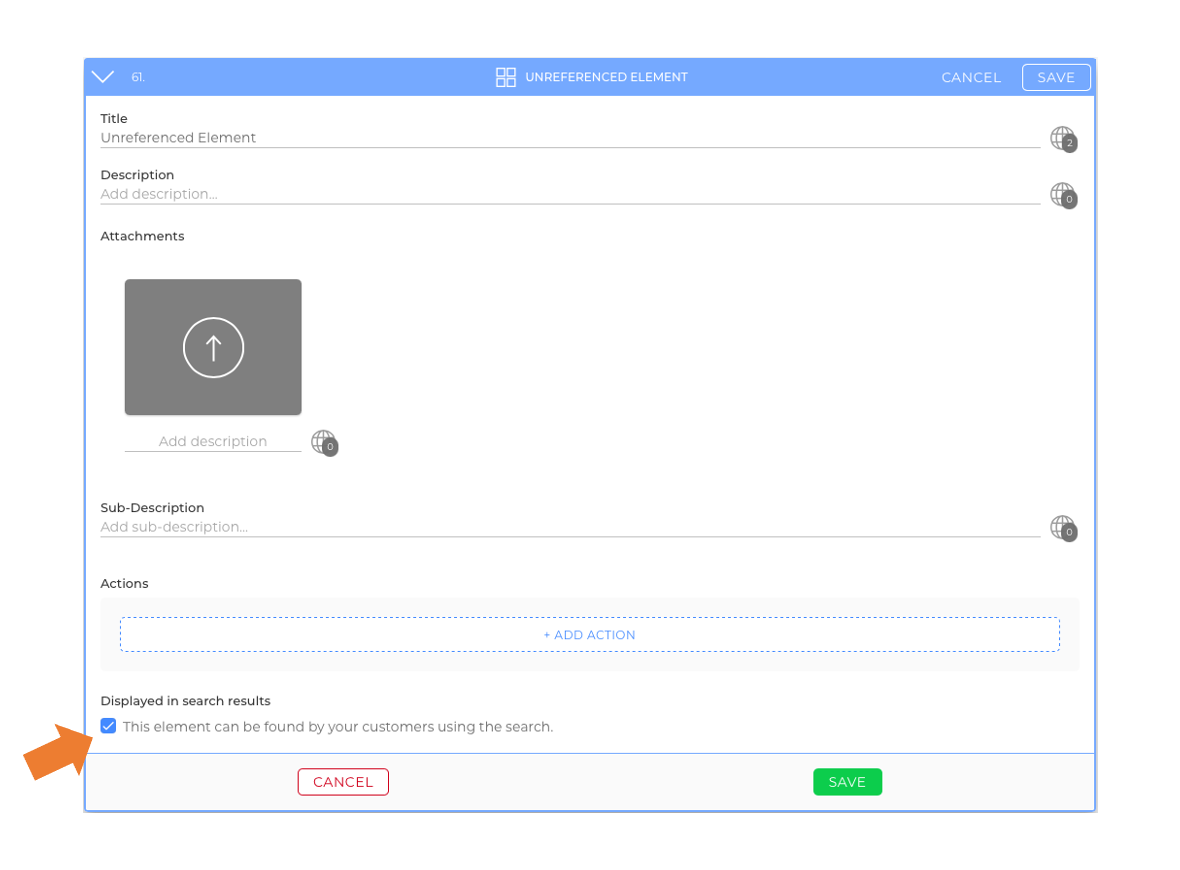
- If an element is not referenced by any other element (picture), users cannot reach it through action buttons. However, depending on its settings (picture), it may still be found via search (video).
- To make an element completely inaccessible, ensure it is neither referenced nor searchable.

Assistant Elements
Each element consists of:
- Title: The heading of the element, which can also be a question.
- Body: A content area for descriptions, instructions, images, videos, and other media.
- Action Buttons: Buttons that guide users through the Assistant.
The Text Assistant supports four different element types, each with unique functions:
- Yes/No Question – Includes two preset action buttons: "Yes" and "No."
- Multi-Answer Question – Allows custom action buttons for multiple-choice responses.
- Step-by-Step Guide – Uses numbered lists to provide instructions.
- Q&A Guide – Uses bulleted lists for structured answers.

Elements List & Preview
Every new element is added to the Elements List. You can rearrange elements via drag & drop. However, note that:
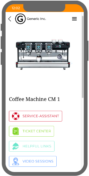
- The top element (position 1) is always the starting point of the Assistant.
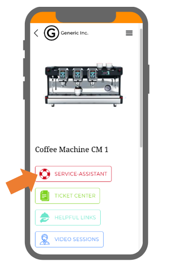
- This element appears immediately after the user clicks the module button (picture).

Previewing the Assistant
To the right of the Elements List, a Preview displays the Assistant from a mobile perspective. This allows content creators to:
- View the content while editing.
- Test navigation by clicking action buttons like a real user.
- Use the reveal button to locate an element being previewed.
Creating the Text Assistant
Before You Start
- Define what kind of content you want to provide:
- Instructions
- Troubleshooting
- Customer Support
- Plan a clear structure for the Assistant.
- Gather necessary media (e.g., images, videos, manuals).
How to Add a New Element
- Click + add element.
- Choose the type of element.
- Enter a title, then click next.
- Customize the body (text, images, or media files).
- Click + add action to create action buttons.
- Enter a title for the button.
- Select the next step from the drop-down menu.
- Note: If no action buttons are created, users will see a default "Back" button.
- (Optional) If you don't want the element to appear in the search, you can disable the search function.
- Click save.
Configuring Action Buttons
Action buttons guide users through the Text Assistant. When adding an action button, consider:
- What action users will take (e.g., answering a question, requesting support).
- Where users should go next (e.g., another element, external link, ticket creation flow, etc).
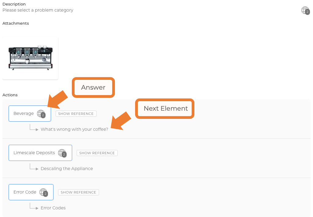
Note: The button label does not have to match the referenced element’s title (picture).
Available Actions for Buttons

General
- + Create Element – Instantly create a new referenced element.
- Back – Takes users to the previous step.
- Back to Home – Returns users to the device's main menu (picture).
External Links
- URL – Opens a specified external website in a new tab.
- Email – Opens an email client with a pre-filled recipient address.
- Phone Call – Initiates a phone call to a specified number.
- Text Message – Opens the messaging app with a pre-filled recipient.
Ticketing
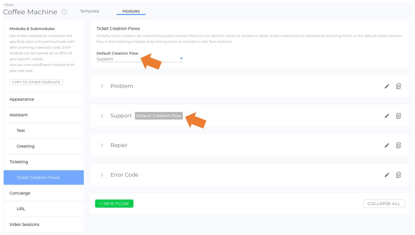
- Ticketing - Default – Directs users to the default ticket creation flow (picture).
- Custom Ticket Creation Flows – Directs users to a specific ticket creation flow.
Assistant
- Elements – Redirects users to another Text Assistant element.
Concierge
- Concierge Elements & Groups – Redirects users to a selected concierge option.
Video Sessions
- Video Sessions - Default – Directs users to the default video session creation flow.
- Custom Video Session Creation Flows – Directs users to a specific video session creation flow.
Structuring the Assistant Effectively
The First Element
We recommend starting with a main menu element that provides an overview of all content and directs users into categories. This helps users quickly find relevant information. Users can also use the magnifying glass to the right of the title to access a search function. To highlight this function, a search bar can be displayed in the first step or as a separate step in front of it. You can specify this via the Entry point settings (video).

Building the Assistant Step-by-Step
Think of the Assistant as a tree structure:
- The first element acts as the trunk.
- Each action button branches into different sections.
- Continue creating all elements for one category before moving to the next.

Tips & Tricks for Optimizing the Assistant
- Use the Placeholder for action buttons when elements you want to reference don’t exist yet.
- Duplicate elements to speed up content creation. Create one version, duplicate it, and adjust as needed. (picture)
- Rearrange buttons via drag & drop for a better user experience.
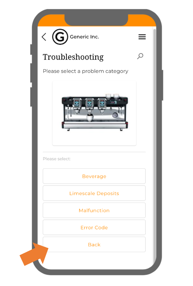
- Always add a "Back" button to improve navigation. (picture)
- Use the Preview to test your content like a real user. Click REVEAL to quickly edit elements displayed in the preview. (video)
- Use SHOW REFERENCE to quickly jump between linked elements. (video)
Good to Know
- The first element determines the starting point of the Assistant.
- Elements without references are inaccessible unless found via search.
- Action buttons can link to other Assistant elements, ticketing, video sessions, and external URLs, and more.
- Continuously update and improve your Assistant to ensure the best user experience.
 We use cookies on our website to give you the most relevant experience by remembering your preferences and repeat visits. By clicking “Accept All”, you consent to the use of ALL the cookies. However, you may visit "Cookie Settings" to provide a controlled consent.